A choropleth map is a thematic map in which areas are shaded or patterned in proportion to the measurement of the statistical variable being displayed on the map. It provides an easy way to visualize how a measurement varies across a geographical area or it shows the level of variability within a region.
In this blog post, we will create a choropleth map of the world depicting immigration from various countries to Canada. The dataset is officially collected by the United Nations and contains the international migrant flows to Canada from other countries from the years 1980 to 2013. You can download the dataset here.
# import libraries
import pandas as pd
import numpy as np
import folium
# read the data into a pandas dataframe
df = pd.read_excel('Canada.xlsx', skiprows=range(20), skipfooter=2)df.head()| Type | Coverage | OdName | AREA | AreaName | REG | RegName | DEV | DevName | 1980 | 1981 | 1982 | 1983 | 1984 | 1985 | 1986 | 1987 | 1988 | 1989 | 1990 | 1991 | 1992 | 1993 | 1994 | 1995 | 1996 | 1997 | 1998 | 1999 | 2000 | 2001 | 2002 | 2003 | 2004 | 2005 | 2006 | 2007 | 2008 | 2009 | 2010 | 2011 | 2012 | 2013 | |
|---|---|---|---|---|---|---|---|---|---|---|---|---|---|---|---|---|---|---|---|---|---|---|---|---|---|---|---|---|---|---|---|---|---|---|---|---|---|---|---|---|---|---|---|
| 0 | Immigrants | Foreigners | Afghanistan | 935 | Asia | 5501 | Southern Asia | 902 | Developing regions | 16 | 39 | 39 | 47 | 71 | 340 | 496 | 741 | 828 | 1076 | 1028 | 1378 | 1170 | 713 | 858 | 1537 | 2212 | 2555 | 1999 | 2395 | 3326 | 4067 | 3697 | 3479 | 2978 | 3436 | 3009 | 2652 | 2111 | 1746 | 1758 | 2203 | 2635 | 2004 |
| 1 | Immigrants | Foreigners | Albania | 908 | Europe | 925 | Southern Europe | 901 | Developed regions | 1 | 0 | 0 | 0 | 0 | 0 | 1 | 2 | 2 | 3 | 3 | 21 | 56 | 96 | 71 | 63 | 113 | 307 | 574 | 1264 | 1816 | 1602 | 1021 | 853 | 1450 | 1223 | 856 | 702 | 560 | 716 | 561 | 539 | 620 | 603 |
| 2 | Immigrants | Foreigners | Algeria | 903 | Africa | 912 | Northern Africa | 902 | Developing regions | 80 | 67 | 71 | 69 | 63 | 44 | 69 | 132 | 242 | 434 | 491 | 872 | 795 | 717 | 595 | 1106 | 2054 | 1842 | 2292 | 2389 | 2867 | 3418 | 3406 | 3072 | 3616 | 3626 | 4807 | 3623 | 4005 | 5393 | 4752 | 4325 | 3774 | 4331 |
| 3 | Immigrants | Foreigners | American Samoa | 909 | Oceania | 957 | Polynesia | 902 | Developing regions | 0 | 1 | 0 | 0 | 0 | 0 | 0 | 1 | 0 | 1 | 2 | 0 | 0 | 0 | 0 | 0 | 0 | 0 | 0 | 0 | 0 | 0 | 0 | 0 | 0 | 0 | 1 | 0 | 0 | 0 | 0 | 0 | 0 | 0 |
| 4 | Immigrants | Foreigners | Andorra | 908 | Europe | 925 | Southern Europe | 901 | Developed regions | 0 | 0 | 0 | 0 | 0 | 0 | 2 | 0 | 0 | 0 | 3 | 0 | 1 | 0 | 0 | 0 | 0 | 0 | 2 | 0 | 0 | 1 | 0 | 2 | 0 | 0 | 1 | 1 | 0 | 0 | 0 | 0 | 1 | 1 |
# dimensions of the data
df.shape
(195, 43)Preprocessing
Let’s clean up the data.
# remove the unnecessary columns
df.drop(['AREA', 'REG', 'DEV', 'Type', 'Coverage'], axis=1, inplace=True)
# rename the columns for simplicity
df.rename(columns={'OdName':'Country', 'AreaName':'Continent', 'RegName':'Region'}, inplace=True)# make all column labels of type string for consistency
df.columns = list(map(str, df.columns))We’ll add a ‘Total’ column to the dataset, which will sum the population from each country throughout the years.
df['Total'] = df.sum(axis=1)Create a ‘years’ variable which we will use later for plotting.
years = list(map(str, range(1980, 2014)))# new dimensions of the dataset
df.shape(195, 39)df.head()| Country | Continent | Region | DevName | 1980 | 1981 | 1982 | 1983 | 1984 | 1985 | 1986 | 1987 | 1988 | 1989 | 1990 | 1991 | 1992 | 1993 | 1994 | 1995 | 1996 | 1997 | 1998 | 1999 | 2000 | 2001 | 2002 | 2003 | 2004 | 2005 | 2006 | 2007 | 2008 | 2009 | 2010 | 2011 | 2012 | 2013 | Total | |
|---|---|---|---|---|---|---|---|---|---|---|---|---|---|---|---|---|---|---|---|---|---|---|---|---|---|---|---|---|---|---|---|---|---|---|---|---|---|---|---|
| 0 | Afghanistan | Asia | Southern Asia | Developing regions | 16 | 39 | 39 | 47 | 71 | 340 | 496 | 741 | 828 | 1076 | 1028 | 1378 | 1170 | 713 | 858 | 1537 | 2212 | 2555 | 1999 | 2395 | 3326 | 4067 | 3697 | 3479 | 2978 | 3436 | 3009 | 2652 | 2111 | 1746 | 1758 | 2203 | 2635 | 2004 | 58639 |
| 1 | Albania | Europe | Southern Europe | Developed regions | 1 | 0 | 0 | 0 | 0 | 0 | 1 | 2 | 2 | 3 | 3 | 21 | 56 | 96 | 71 | 63 | 113 | 307 | 574 | 1264 | 1816 | 1602 | 1021 | 853 | 1450 | 1223 | 856 | 702 | 560 | 716 | 561 | 539 | 620 | 603 | 15699 |
| 2 | Algeria | Africa | Northern Africa | Developing regions | 80 | 67 | 71 | 69 | 63 | 44 | 69 | 132 | 242 | 434 | 491 | 872 | 795 | 717 | 595 | 1106 | 2054 | 1842 | 2292 | 2389 | 2867 | 3418 | 3406 | 3072 | 3616 | 3626 | 4807 | 3623 | 4005 | 5393 | 4752 | 4325 | 3774 | 4331 | 69439 |
| 3 | American Samoa | Oceania | Polynesia | Developing regions | 0 | 1 | 0 | 0 | 0 | 0 | 0 | 1 | 0 | 1 | 2 | 0 | 0 | 0 | 0 | 0 | 0 | 0 | 0 | 0 | 0 | 0 | 0 | 0 | 0 | 0 | 1 | 0 | 0 | 0 | 0 | 0 | 0 | 0 | 6 |
| 4 | Andorra | Europe | Southern Europe | Developed regions | 0 | 0 | 0 | 0 | 0 | 0 | 2 | 0 | 0 | 0 | 3 | 0 | 1 | 0 | 0 | 0 | 0 | 0 | 2 | 0 | 0 | 1 | 0 | 2 | 0 | 0 | 1 | 1 | 0 | 0 | 0 | 0 | 1 | 1 | 15 |
# download countries geojson file
!wget --quiet https://s3-api.us-geo.objectstorage.softlayer.net/cf-courses-data/CognitiveClass/DV0101EN/labs/Data_Files/world_countries.json -O world_countries.json

print('GeoJSON file downloaded!')
GeoJSON file downloaded!Now that we have the GeoJSON file, let’s create a world map, centered around [0, 0] latitude and longitude values, with an intial zoom level of 2, and using Mapbox Bright style.
world_geo = r'world_countries.json' # geojson file

# create a plain world map
world_map = folium.Map(location=[0, 0], zoom_start=2, tiles='Mapbox Bright')
Create a choropleth map.
# generate choropleth map using the total immigration of each country to Canada from 1980 to 2013
world_map.choropleth(
    geo_data=world_geo,
    data=df,
    columns=['Country', 'Total'],
    key_on='feature.properties.name',
    fill_color='YlOrRd',
    fill_opacity=0.7,
    line_opacity=0.2,
    legend_name='Immigration to Canada'
)

# display map
world_map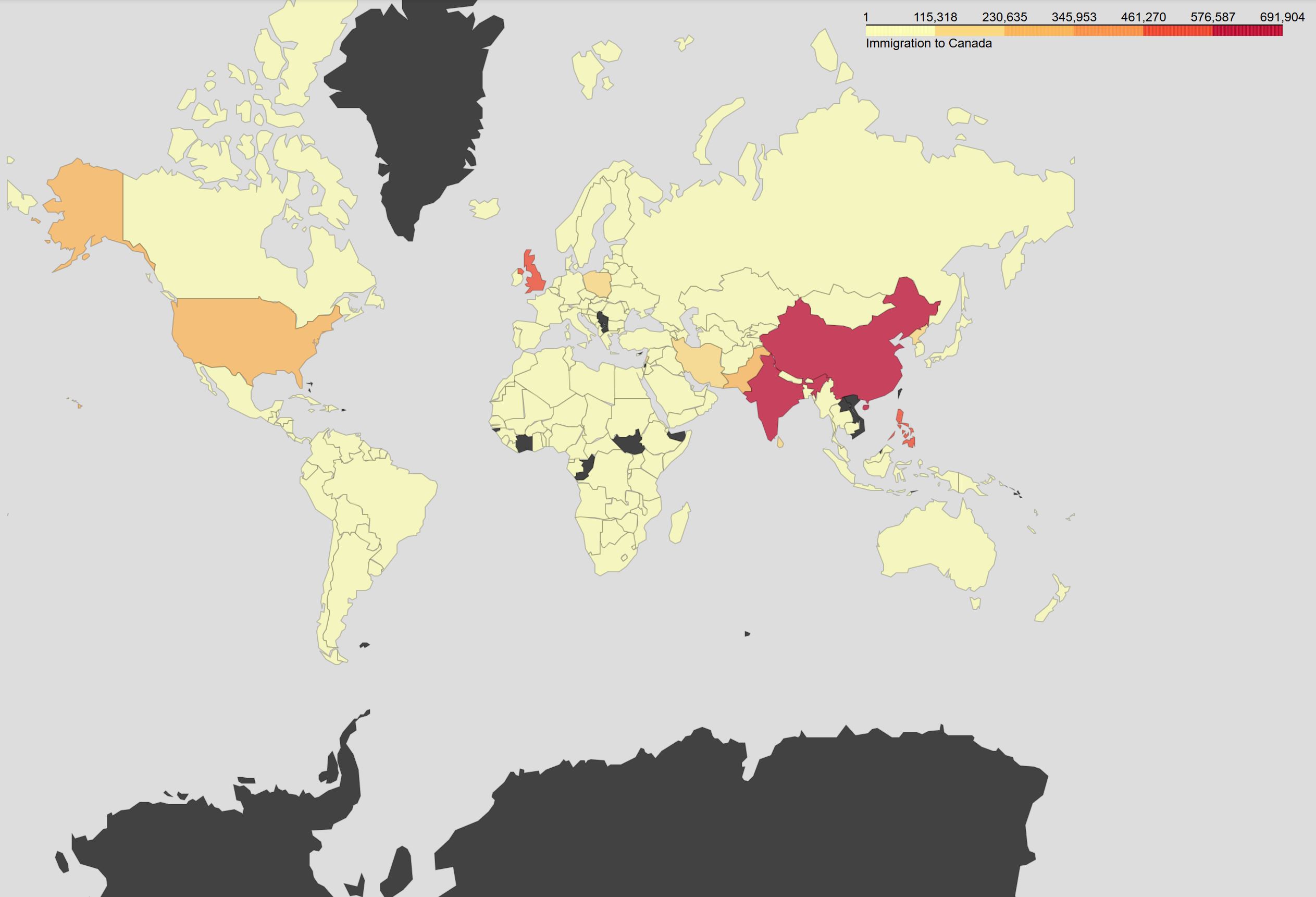
As per the map legend, the darker the color of a country and the closer the color to red, the higher the number of immigrants from that country. Accordingly, the highest immigration over the course of 33 years (from 1980 to 2013) was from China, India, Great Britain, and the Philippines, followed by Pakistan, the US, and Poland.