In this blog post, we will be looking at Agglomerative Hierarchical Clustering. This is a bottom up approach of hierarchical clustering.
# import libraries
import numpy as np
import pandas as pd
from scipy import ndimage
from scipy.cluster import hierarchy
from scipy.spatial import distance_matrix
from matplotlib import pyplot as plt
from sklearn import manifold, datasets
from sklearn.cluster import AgglomerativeClustering
from sklearn.datasets.samples_generator import make_blobs
%matplotlib inline
Generate random data
We will be generating a set of data using the make_blobs class.
The input parameters for this class are: - n_samples: The total number of points qually divided among clusters. - centers: The number of centers to generate, or the fixed center locations. - cluster_std: The standard deviation of the clusters. The larger the number, the further apart the clusters.
We will save the result to X1 and y1.
X1, y1 = make_blobs(n_samples=50, centers=[[4,4], [-2,-1], [1,1], [10,4]], cluster_std=0.9)Plot the scatter plot of the randomly generated data.
plt.scatter(X1[:, 0], X1[:, 1], marker='o')<matplotlib.collections.PathCollection at 0x1e595219198>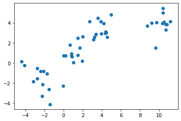
Agglomerative clustering
Cluster the random data points we just created.
The AgglomerativeClustering class requires two inputs: - n_clusters: The number of clusters to form as well as the number of centroids to generate. - linkage: Which linkage criterion to use. This determines which distance to use between sets of observations. The algorithm will merge the pairs of clusters that minimize this criterion.
agglom = AgglomerativeClustering(n_clusters=4, linkage='average')Fit the model with X2 and y2 from the generated data above.
agglom.fit(X1, y1)AgglomerativeClustering(affinity='euclidean', compute_full_tree='auto',
connectivity=None, distance_threshold=None,
linkage='average', memory=None, n_clusters=4)Plot the clustering.
plt.figure(figsize=(12,8))

# scale down the data points to prevent scattering

# create a minimum and maximum range of X1
x_min, x_max = np.min(X1, axis=0), np.max(X1, axis=0)
# get the average distance for X1
X1 = (X1 - x_min) / (x_max - x_min)

# loop to display all of the datapoints
for i in range(X1.shape[0]):
    # Replace the data points with their respective cluster value
    # (ex. 0) and is color coded with a colormap (plt.cm.spectral)
    plt.text(X1[i, 0], X1[i, 1], str(y1[i]),
             color=plt.cm.nipy_spectral(agglom.labels_[i] / 10.),
             fontdict={'weight': 'bold', 'size': 9})

# remove the x ticks, y ticks, x and y axis
plt.xticks([])
plt.yticks([])

# display the plot of the original data before clustering
plt.scatter(X1[:, 0], X1[:, 1], marker='.')

# display the plot
plt.show()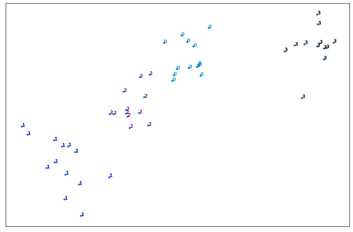
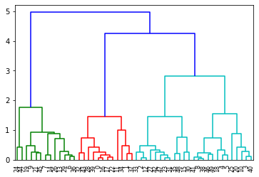
Dendrogram
A distance matrix contains the distance from each point to every other point of a dataset.
Use the function distance_matrix, which requires two inputs. Use the feature matrix, X2, as both inputs, and save the distance matrix to a variable called dist_matrix. One way to check that your matrix is correct is to make sure that the distance values are symmetric, with a diagonal of zeros.
dist_matrix = distance_matrix(X1, X1)
print(dist_matrix)
[[0. 0.10264836 0.75840228 ... 0.71198038 0.58237479 0.42606018]
[0.10264836 0. 0.67498119 ... 0.62861156 0.48764469 0.33707566]
[0.75840228 0.67498119 0. ... 0.04644316 0.22929692 0.3396303 ]
...
[0.71198038 0.62861156 0.04644316 ... 0. 0.19162587 0.29360964]
[0.58237479 0.48764469 0.22929692 ... 0.19162587 0. 0.1638079 ]
[0.42606018 0.33707566 0.3396303 ... 0.29360964 0.1638079 0. ]]Save the result to a variable called Z.
Z = hierarchy.linkage(dist_matrix, 'complete')C:\Users\prana\Anaconda3\lib\site-packages\ipykernel_launcher.py:1: ClusterWarning: scipy.cluster: The symmetric non-negative hollow observation matrix looks suspiciously like an uncondensed distance matrix
"""Entry point for launching an IPython kernel.Hierarchical clustering is typically visualized as a dendrogram. Each erge is represented by a horizontal line. The y-coordinate of the horizontal line is the similarity of the two clusters that were merged. By moving up from the bottom layer to the top node, a dendrogram allows us to reconstruct the history of merges that resulted in the depicted clustering.
dendro = hierarchy.dendrogram(Z)